


There is not one amongst us who has not been guilty at one time or another of buying alcohol, simply because of the look of the label.
Graphic design, whether it’s seen in labeling, general packaging, advertising, or even general promotions, subconsciously sways us more than we would like to admit. It influences our perception of the brands that we like and what we think buying those brands says about us.
One designer, who’s done a lot of work for brands from Bacardi and American Liquor Co through to Appleton Estate and Aviation, is Shaun O’Rourke.
To see some of the work done by Shaun O’Rourke, visit black-irish.com
 PIN IT
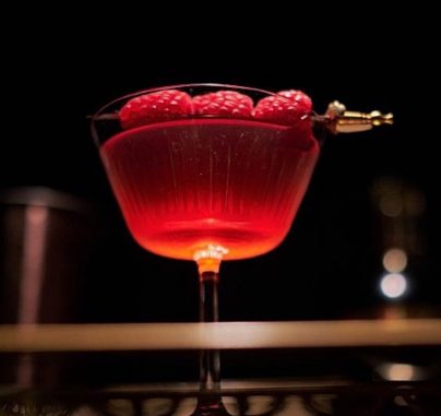
Brand design by Shaun O’Rourke
Interviewer:
There is not one amongst us who has not been guilty at one time or another of buying alcohol, simply because of the look of the label. Graphic design, whether it's seen in labelling, general packaging, advertising, or even general promotions, subconsciously sways us more than we would like to admit. It influences our perception of the brands that we like and what we think buying those brands says about us. One designer, who's done a lot of work for brands from Bacardi and American Liquor Co through to Appleton Estate and Aviation, is Shaun O'Rourke.
Thank you for joining us, Shaun.
Shaun O'Rourke:
Thanks for having me.
Interviewer:
How does a graphic designer & art director end up getting into work with alcohol brands?
Shaun O'Rourke:
Well, actually it was truly a matter of right place at the right time. Several years back in New York, I had some friends that were starting up some liquor projects, which I got involved with at the time. I was also a creative director for a small advertising agency in Soho, which was primarily focused on arts and entertainment and fashion. These categories, as you know, overlap into the liquor industry. Once I'd designed a few brands for these friends, word of mouth brought in new clients. Essentially, everything I design is a form of translation, where I take the sentiment of the client and try to transfer it into something visual.
Interviewer:
How much influence do you think design has on our perception of booze?
Shaun O'Rourke:
I would say, very much. This is truly a book to judge by its cover. Take the craft spirit movement for instance, it's a perfect example. It's more of a design movement really than an actual product movement. And by that, I mean that there's a lot more going on in the label than there is inside the bottle. The actual ingredients may vary very little, but the perception is always jiggered by the choice of wording on the label.
So for instance, a brand like Tito's seems to be a bit of a misnomer due to the size of the organization and the high volume of their production, which is obviously contradictory to their handmade verbiage. So, you get the consumer picturing some guy named Tito with his dog, making these small batches, and that simply couldn't be further from the truth, but just the notion of handmade being on that label is a confidence builder in the mind of most consumers. It's also a carry over from the world of food products where the more natural, the better, and as such it drives purchase decisions.
Interviewer:
So, to your mind, there are a lot of people who will buy products simply because of the look and feel that's expressed by the packaging?
Shaun O'Rourke:
Yes, there can, but aesthetics vary from person to person as well as from brand to brand. And at the end of the day, brands are made up of people and as people, they have many viewpoints and opinions. So, in this ever-growing, socialised media world, many people are sensitive to the perceptions of others and may choose something that's showy and well-designed so that they can seem to be ‘in the know’, whereas for others, price is the driver. But there are some fairly reliable indicators of quality. For instance, no-frills looking packaging would naturally draw in a consumer who's cost conscious, whereas an obviously customised bottle with embossed glass, textured labels, hot foil, et cetera, will denote a higher price point and indicate a higher quality product.
Interviewer:
How difficult is it for you, especially with a new brand, to work out who their market is?
Shaun O'Rourke:
Well, that will often come about through a brief and doing an analysis of the demographics that they're looking at. There's no one answer. It really depends. What we do is completely a strategic exercise that's based on predetermined criteria as discussed by the client and through a lot of research.
Interviewer:
Things like colour though, certain people react to certain colours more than others. It must be difficult to know what will hit with the majority of people, wouldn't it?
Shaun O'Rourke:
For colours, yeah, there's always a psychological component to colours, but something I think is often overlooked, but is really weighty in the decision, particularly with booze, is the shape of the bottle, the actual silhouette.
Which can tell quite a bit about the personification of the brand. The relation of the neck to the shoulder, to the base, can all communicate different things and you want that to really match up with what you're trying to go for and the demographic you're trying to attract.
Interviewer:
Can you give us an example of that?
Shaun O'Rourke:
An example of that. An example I'm particularly focused on now is a new brand that you won't be able to see for a while, but the reasoning behind the comment is the amount of time we spent looking at silhouettes to determine the attributes of personification. The proud shoulders of a bottle can communicate a male attribute or a proudness. The length of the neck versus the girth can communicate anything from sloppy to elegant. And the relation of one to the other can totally make it work or not.
Interviewer:
I'd always assumed that the shape of the bottle often came down to what was easiest for a bartender to use in a speed rail.
Shaun O'Rourke:
It's definitely one of the considerations, but in the landscape, it's quite a crowded field. So, sometimes if you want to stand out, you need to pay attention to ... There's a lot of bottles that are reproduced in similar molds out there. So, if you want to look like you've been in a category that's been there for years, that's sometimes a strategy that we employ. And other times you want to stand out from the crowd, maybe having your head above or a wider base to communicate grounded-ness, there's a lot of subtleties in the choices that are made there.
Interviewer:
In the work that you specifically do, do you feel that you have a certain look and feel to the designs?
Shaun O'Rourke:
Well, the needs will vary according to the client, but I tend to gravitate toward projects that have some need for a level of sophistication in their communications, plus a decent budget for effects like embossing, foil stamping, et cetera, doesn't hurt either. I'm not too big a fan of plain text-driven, utilitarian design, which seems to have been becoming more and more popular. I feel that those are often reflective of recent trends of hiring less than seasoned designers for often lower budgets and creative directors with a lack of vision, who often seek to mimic what's already been done rather than trying to birth something new.
Interviewer:
Do you think that those utilitarian designs will "age badly."?
Shaun O'Rourke:
I do. I do think so. I think it's more of a bandwagon and a lack of a greater vision, but also somewhat of a response to maybe over-ostentatious design that was out maybe a few years ago, where the field just got really crowded with that. So, as it goes one way, the pendulum always swings the other and we get to examine the space in between.
Interviewer:
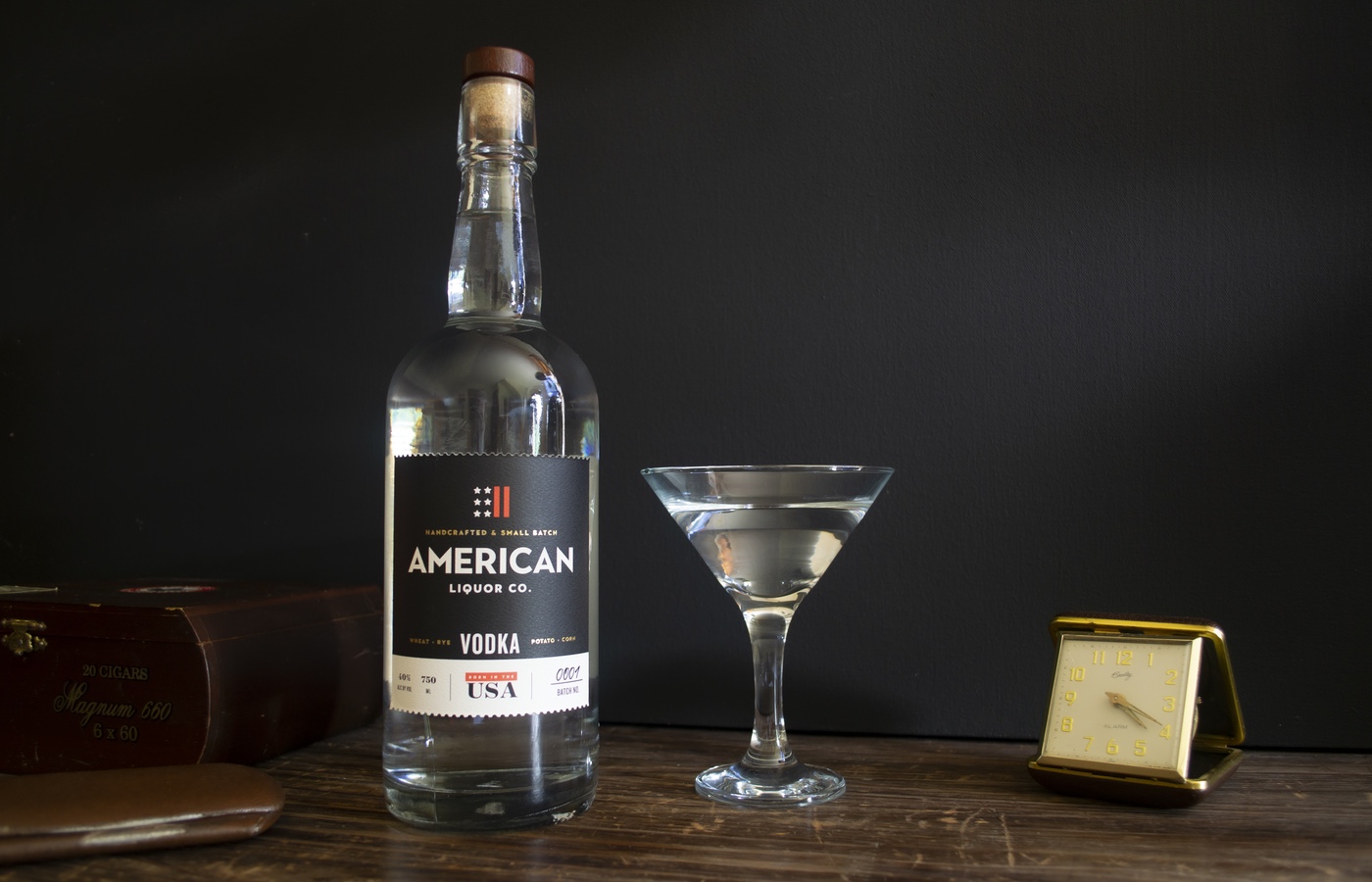
Now, when you're creating the look and feel for new brands, such as you did American Distilling recently, how much freedom do you normally get?
Shaun O'Rourke:
Well, to be honest, there's nothing more liberating than a tight creative brief. That strong creative brief will give you freedom that unlike a piece of art, products are very mission-oriented. The scope is discussed, decided upon in order to arrive at the mark. So, our team at American Liquor Company collectively came up with some assumptions that we tried to employ. And before we brought to market, we realised we needed to actually test it against some consumer opinions. So, we did some surveys and some test groups, which was lucky because some of our initial assumptions that we brought to the table, came across in a totally different way than what was originally intended. So, necessitated a midstream change of strategy, but being nimble on your feet, I guess, is a critical aspect to not losing too much sleep at night.
Interviewer:
How important is it to actually take designs and take ideas like that out to the market before you launch?
Shaun O'Rourke:
It depends on the proposition. With American Liquor Company, just the term American, can mean many things to many people, as I'm sure you can well imagine. So, we didn't want to come across as political or having a stake in the game politically. So, we needed to redefine what American meant. So, we focused on the ideals of the makers, the people that are behind the scenes, creating. And that became a critical driver for the concept, which was a little bit different than the initial position, which was more tongue-in-cheek. It didn't test well and it made our company seem like something that we were not. So, we definitely had to refine that and I think we're all the better for it now.
Interviewer:
When you're working with more established brands, such as Appleton Estate or Bacardi, for example, I imagine you're working very tightly within their established guidelines. Is that the case?
Shaun O'Rourke:
That is the case. Ordinarily, I'm just working with campaign materials around consistent and obviously recognisable brand marks. So, the fence posts are already there, so they keep me in the yard, so to speak. The concept of the campaign is where the creativity comes in. So for instance, with Appleton Estate, as you mentioned, their national bartender challenge Remixology, was the term that was come up at meetings, which was left to me to define. They gave me a pretty high degree of decision-making authority in order to visualise that. But that amount of sway definitely varies depending on the legacy of the brand and other considerations to their shareholders.
Interviewer:
When you've got a legacy brand like that, is being able to define a term like Remixology, better or worse in terms of how you design?
Shaun O'Rourke:
Being able to design it, of course there's bureaucracy. It has to go through a lot of decision making heads before it's finalised, but I always prefer to have as clean a canvas as possible for a new design.
Interviewer:
When doing packaging design around a label, for example, how difficult is it to express your intent with such a small amount of real estate?
Shaun O'Rourke:
That can definitely be challenging, often very challenging, but big ideas can come in small packages and sometimes they have to. On average, a lot of liquor labels are not much bigger than a business card, and there's a lot of criteria that needs to be met, especially from the TTB under the Department of the Treasury, which dictates everything from font sizes to the descriptive language and other considerations. And you cannot get around that until they approve the label. So, to get by those gatekeepers, it's not always easy and sometimes requires several submissions.
Interviewer:
So, there is actually legislation involved that regulates size of font and various things like that.
Shaun O'Rourke:
Yes. Even down to the language and certain considerations, government warnings, et cetera. Strict, very strict.
Interviewer:
Speaking of font, how important is font compared to something like colour or shape?
Shaun O'Rourke:
Well, the font is, let's see, it is very important to communicate attributes of the personification, but it has to fit well within ... Like I said, I believe the bottle shape is one of the most important aspects because it takes up the biggest space and it's the space on the shelf. Next, your focal point will be the font. So, I guess, I'd view the font more as a well chosen accessory to the right outfit.
Interviewer:
Talk us through what information you need in a brief. What do you need to know?
Shaun O'Rourke:
Well, I'll generally start with asking a little bit of background on the company. Where they're coming from, where they're trying to go. But most importantly, I want them to identify one primary objective for the communications that I'll be providing. So, sometimes the client will want more traffic on their website or maybe high attendance to an event. Maybe they're just starting their business and they're looking for exposure.
But the fact is, everything I do serves a purpose strategically, and I need to keep those objectives in mind when designing for the client in order to achieve them. We'll also analyze their current branding strategy, if they have one, or make recommendations, if they don't yet. We need to identify their target audience, what their target audience currently thinks and what we would like them to think, more importantly, and who that competition is. All of that goes into a creative audit and that's the basis for developing the brief.
Interviewer:
So, are you often quite involved in how the brief ends up looking?
Shaun O'Rourke:
Well, it's a back and forth. There's objectives that they communicate to me and then I try to translate the sentiment into a form that is cohesive and makes sense.
Interviewer:
Once you have the brief, how long, and what is the process, to getting to the finished design?
Shaun O'Rourke:
Length of time is always different, but in most all cases, I'll start with a hefty amount of research in order to determine the state of the competitive landscape, the history of similar brands and products, and possibly the overall aesthetics that have been used by others. Depending on the strategy we identify, we could then choose to either differentiate from the pack or in some cases to fit in. And that's a choice, it's basically one or the other in every example.
At that point, I'll then explore several design options, present them to the client with descriptions of my reasoning. And once one or more directions are chosen, I'll provide some fine-tuned examples and variations on the themes. And this process may repeat until I get an email from the client with two or more exclamation marks on their comments because punctuation doesn't lie.
Interviewer:
The obvious question, of course, with the research that you're doing is how much tasting of the product do you need to do to get truly inspired?
Shaun O'Rourke:
In some cases there's not even an opportunity to taste because formulation or tweaking the formula can be happening concurrently to the design, but in the cases where there is product available, it's just enough to understand the product proposition really. My passion really lies in the professionalist strategic attributes rather than in the product itself. So, as a communications specialist, it's my job to make sure that it makes sense.
Interviewer:
Do you think that there is a great deal of difference between designing for liquor to designing for any other industry or business?
Shaun O'Rourke:
Well, again, it's always a translation exercise, but the regulation is something that can inhibit quite a bit. In fact, several times I'd come up with a full label design and we submit it to the TTB and so much needs to change, sometimes in successive rounds, bit by bit. And then after a few rounds, the whole character starts to shift and then you have to reevaluate, move things around, and try to pull it back to center, just based off of those regulations. But it's probably not as hard as say, the cannabis field, where those regulations vary from state to state and sometimes month to month. So, there's a lot you need to stay up on.
Interviewer:
What do you look for in an ideal client?
Shaun O'Rourke:
Well, I think the ideal client is one that's not trying to be the designer, and one that has an open mind and is willing to explore options. So, this person will realise that building a brand is a structured, disciplined activity, and shouldn't be done just for frivolous reasons. So, the ideal client won't come to the table saying that their personal favourite colour is blue and they like koala bears, so they want that included on their label.
So, they understand that solid brand is built like a hologram, in that a small piece of it should contain enough information from the whole to still make sense and communicate something about the brand ethos. We have a test that we like to employ while we're building brands, which I call it the Snickers Bar test. And it simply means that no matter where you cut into it, you should find chocolate and nuts. And that's basically the essence of a strong brand build.
Interviewer:
What have been some of your favourite alcohol projects to date?
Shaun O'Rourke:
I'm partial to the startups because of their flexibility. But there was a few in particular that stand out. There was a few years back, a Brazilian Acai liqueur called Cedilla. It was very interesting because it had a short but unique creative brief. The client told me he wanted something of a cross between the symbol formerly used by Prince and a port wine bottle.
So, it left a lot open to interpretation and ended up being really successful in the end. Another favourite probably was a Greek Mastiha liqueur called Kleos, which comes from the sap of trees that only grow on the Greek island of Chios, which is an interesting attribute in itself. But this was especially fun since I was able to design the bottle itself to mimic the Greek Doric columns from the region. So, we went totally stock on that bottle. That was fun.
Interviewer:
Is there an alcohol brand that you would like to do work for?
Shaun O'Rourke:
I like the new. At this stage in my career, I feel that carrying torches of the legacy brands can be done easily enough by production designers. And I want that raw canvas. So, to go from words to thoughts, to reality, to me is a fascinating process and one that I like to explore from start to finish.
Interviewer:
With that said, do you think a lot of alcohol brands miss the boat when it comes to the design opportunities that they have?
Shaun O'Rourke:
Well, some do, but I think it really comes down to a matter of resources versus risks. Everything at the end of the day is opinion-based. And once you let your brand out into the wild, the crowd will either reject it or agree with the assumptions that you put forth. Sometimes startups may lack the resources to put a lot of money into design, bearing in mind all the other considerations. So, you don't know until you get into the market and then the crowd will let you know.
Interviewer:
Do you believe an irreverent nature is required for alcohol design?
Shaun O'Rourke:
Actually, no, not for alcohol design in particular. I'd say relevance is the main formula for success in this field. The promise of tastes is a confidence builder to the public, and you need to establish that trust for a new brand. Plus, there's a lot of noise in the field. There are very few examples I can think of where irreverence has actually worked out in spirits. In fact, I can think of one brand of vodka that came out a few years back called Ivanabitch vodka, and they tried to come out with a tongue-in-cheek message, but it ended up being more of a bludgeon of a plan. So, I think they were expecting to have a red carpet premiere, but ended up being the liquor equivalent of straight to the bargain bin DVD.
Interviewer:
With our short attention spans now, do you think that good graphics are more important than ever?
Shaun O'Rourke:
I do, but it may be a biased opinion since it's my field, but you do need to stand out in an ever increasing landscape of brands. And it's always a balancing act. Sometimes the message can be communicated simply, but sometimes the complexity will draw in a new customer. And I think building brands, it's more of a marathon than a sprint.
Interviewer:
All right. Well, look, Shaun, thank you for taking the time to speak with us today. If people want to see more of your work, they can of course find you at black-irish.com.
Shaun O'Rourke:
Yes.
Interviewer:
Now, I'd be curious as to where that's come from?
Shaun O'Rourke:
Black Irish is an apparel company that I started back in 2004 with my wife who's from South Africa. So, it was basically the two of us came up with the term Black Irish, because it's one that is familiar, but it's not a clearly defined term. So, I thought it was perfect for what we were trying to approach at the time.
Interviewer:
Or alternatively, you can of course be reached via your socials, which are Shaun O'Rourke Design on LinkedIn or Black Irish Apparel, as you've just mentioned, on Facebook.
Shaun O'Rourke:
Correct. Yes.
Interviewer:
Now, before I let you go, I'm interested to understand why someone who is so visually-orientated is not actually on Instagram?
Shaun O'Rourke:
To be honest, it's truly a matter of time and my dance card's quite full at the moment and these things, I don't just do it for the likes, I do it for the clients. And my own artwork, I know if I like it or not, so that's okay with me.
Interviewer:
Fair enough.
Shaun O'Rourke:
I'm kind of old school in that regard. Yeah.
Interviewer:
Fair enough. All right, Shaun. Well look, thank you again for taking the time. Yeah. Have a good day.
Shaun O'Rourke:
Thank you very much. You as well.